The wools I use don't come in the same shades as the cottons and acrylics, of course, so I went through my sample cards and found the best matches I could. These will be the predominant colours:

As I've talked about elsewhere, it's taken me a while to get used to planning warps for my wool blankets since putting the sectional rakes on Mabes. The planning is the sticky bit, as I much prefer to let stripes happen spontaneously - I wind chains of one or more colours until they seem "about right" (very subjective!) and then switch to a new chain. Some chains are skinny, some are wide. Some are solid, some are striped. Once I've got enough threads for the warp, I flop them over the front beam of the loom and move them around until I find the arrangement pleasing. This does not work with sectional warping!
Since the advent of the rakes, I've tried planning my stripes by moving around balls of yarn or doodling on paper or by working them out in Fiberworks PCW, but nothing's been very satisfying. Fiberworks has been the best approach but I've always been frustrated by trying to get the colours to really match the yarns I'm using. I've tried their colour editor but just haven't been very successful matching the ball in my hand to the colour on the screen.
Today, though, I finally tried something I've been thinking about for ages and it was, as they say, The Business. Here's what I did:
1) I took the picture above of the colours I plan to use, without flash to get as close to the actual colours as possible.
2) I opened the picture in Photoshop and made some minor adjustments to make the colours even more accurate. In this case, that meant Image -> Adjustments -> Variations... -> more green. For some reason, when there isn't enough natural light, my camera tends to skimp on the green, like it did here.
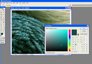
3) I zoomed way in on each ball and used the eyedropper tool to "pick up" the colour of that ball. This required clicking on the ball several times until I got something close, as every pixel is its own colour and some are highlights, some are shadows - you'd be amazed at the variety in a chunk of seemingly solid colour.
4) This put me in the right colour neighbourhood but still didn't give me exactly what I wanted so I opened the colour editor and used the mouse to move the little circle around until the colour selection seemed perfect. The colour editor displays the colour in various ways, including its RGB value. Here's what it looks like:

See the colour indicator in the small toolbar way over on the left? That's the one you left click to open the editor. See the little white circle in the bottom right part of the colour gradient window? That's the guy you drag around to change the colour selection. See the highlighted blue text in the colour editor? That's the R(ed) value, which is above the B(lue) value, which is above the G(reen) value.,1 This RGB value is also one of the ways you can enter colours into the editor in Fiberworks, so make a note of it. In my example, my colour's value is 20, 72, 69.
5) I opened Fiberworks and started editing the top five colours in the palette on the very right side of the screen. FYI: you'll want to avoid editing the very top value, that white one which is labeled -, 'cause doing so seems to mess up the works. Looks like that colour gets used for more than just applying colours to your warp, so leave it alone and start with the one below it, labeled 1, or whichever other one you find easiest to use.
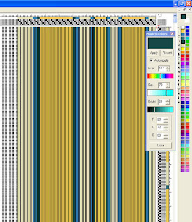
To edit a colour in Fiberworks, right click on the little coloured box in the palette. This opens up its colour editor which, sadly, is not as intuitive or easy to use as Photoshop's. Still, if you're armed with an RGB value from Photoshop or some other photo editor, it's easy peasey to enter it into the RGB fields at the bottom - the other fields will take care of themselves:

Here you can see that I've entered the RGB value from Photoshop (20, 72, 69) at the bottom of the editor and the colour at the top has miraculously changed to match my ball of yarn. You might also be able to tell that I've entered my five colours in the first five positions in the left hand column of the colour palette to the right (skipping the white one at the top). As a bonus, you can also see the stripe arrangement I settled on in the end for my blanket warp.
Happily, I have enough yarn for the warp in my stash, so I can start winding bobbins and then winding on right away. I might have to order a little for the weft since I'll put on enough for three blankets but then again I might just dig through the stash and improvise with what I've got on hand. At least in the weft I can still let my stripes be totally spontaneous!
1. Incidentally, the hex value below those - the one that starts with the hash (#) - is the colour code you'd use in html. If you ever want to make a webpage background or text match your photo, that guy's the one you want.


4 comments:
I never worry about getting the exact colors in my weaving software. I feel that the software does two things: it gives me an approximation of what the finished item is going to look like, but only an approximation. And it shows me errors and other technical glitches. This last I find invaluable.
And good luck on your scarf-a-day!
When I'm working with structure, I don't worry so much about matching colours. If I can establish that my fabric is structurally sound, or figure out an alternate threading/treadling/tie up, or accomplish whatever my goal is, I'm happy.
When I'm using Fiberworks to plan colour stripes, though... then I get a bit anal. And since what I'm really missing is being able to rearrange the wound chains and seeing how the colours and stripe widths interact, it's really important to me to get the colours right so that I can envision it as clearly as possible.
And thank you! Gonna post the ground rules to SaD in a bit, first scarf tomorrow! Picked out my warp - really looking forward to it after this crackle business.
The scarf thing will be very different from the crackle and will offer you a different and interesting challenge. By the way, should you decide to weave a crackle blanket with 3 shuttles, I bet you would become quite facile with handling them!
Post a Comment